KB brand guidelines: the Kristian Bansil identity
The KB identity.
One geometric system of stems, horizontal-cut diagonals and perfect circles. It builds the monogram, the typeface and every graphic. The whole identity sits on Cloud Dancer, Pantone's Color of the Year 2026.
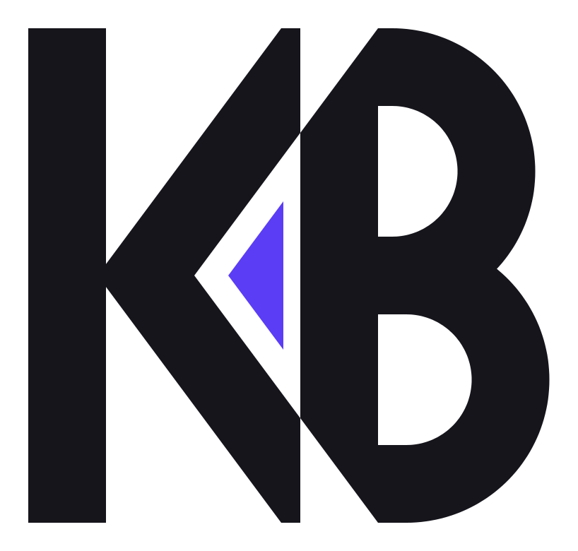
Hover to split · click to ignite
01 · The mark
The K's arms end exactly where the B's stem begins. The triangle they enclose is the spark: the AI at the core of the work.
K
A stem and two diagonals meeting in a chevron. Forward motion.
Spark
The negative space between the letters, filled. The AI at the core.
B
Two equal bowls built from the same circles as the typeface.
02 · Typeface
My own geometric display face, designed for the KB brand. Monoline, unicase, in Regular and Bold. It's built from the same geometry as the monogram.
Display
KB ORBIT BOLD
KB ORBIT REGULAR
Text companion
Geist Sans
For body copy, interfaces and long reading.
03 · Colour
PANTONE 11-4201 Cloud Dancer, a lofty, balanced white, is the canvas. Midnight Ink gives structure. Orbit Violet and Ember Signal bring the energy.
Tints
Accents are mixed with Cloud Dancer, never with pure white, so every tint stays warm.
KRISTIAN BANSIL
Freelance · Web · Marketing · AI
BRANDS
THAT
THINK.
Short answer
What is Cloud Dancer?
Cloud Dancer (PANTONE 11-4201) is Pantone's Color of the Year for 2026: a soft, balanced white. The KB identity uses it as its canvas (HEX #F0EEE9). It's paired with Midnight Ink for type, Orbit Violet and Ember Signal as energy accents, and Lumen as a highlight.
- Canvas
- Cloud Dancer #F0EEE9 (PANTONE 11-4201)
- Type
- Midnight Ink #16151C
- Accents
- Orbit Violet #5B3DF5, Ember Signal #FF6A3D
- Highlight
- Lumen #E4FF5C
- Typefaces
- KB Orbit (display), Geist Sans (text)
Key facts
FAQ
Brand questions
What does KB stand for?
KB are the initials of Kristian Bansil. The monogram is the core of the personal brand used across this site, proposals and social profiles.
What font does this site use?
Headlines use KB Orbit, a custom geometric display typeface designed for the KB brand in Regular and Bold. Body text uses Geist Sans.
What do the parts of the KB logo mean?
The K's arms meet the B's stem, and the triangle they enclose, called the spark, represents the AI at the heart of the work. The mark uses the same geometry as the KB Orbit typeface.
Can I download the KB logo?
Yes. Ink and cloud versions of the mark are available as SVG files on this page for press and partner use. Please don't alter the proportions or colours.